A monospaced  version of an existing typeface by Swiss type foundry.
Beautiful 'GT Super' by Grilli Type is the result of their extensive investigation into display serif typefaces from the 1970s and 80s. It focuses on the expressive and idiosyncratic nature of calligraphic motions, compelled into stable, typographic shapes. With this in mind, I have made a monospaced
version of an existing typeface by Swiss type foundry.
Beautiful 'GT Super' by Grilli Type is the result of their extensive investigation into display serif typefaces from the 1970s and 80s. It focuses on the expressive and idiosyncratic nature of calligraphic motions, compelled into stable, typographic shapes. With this in mind, I have made a monospaced 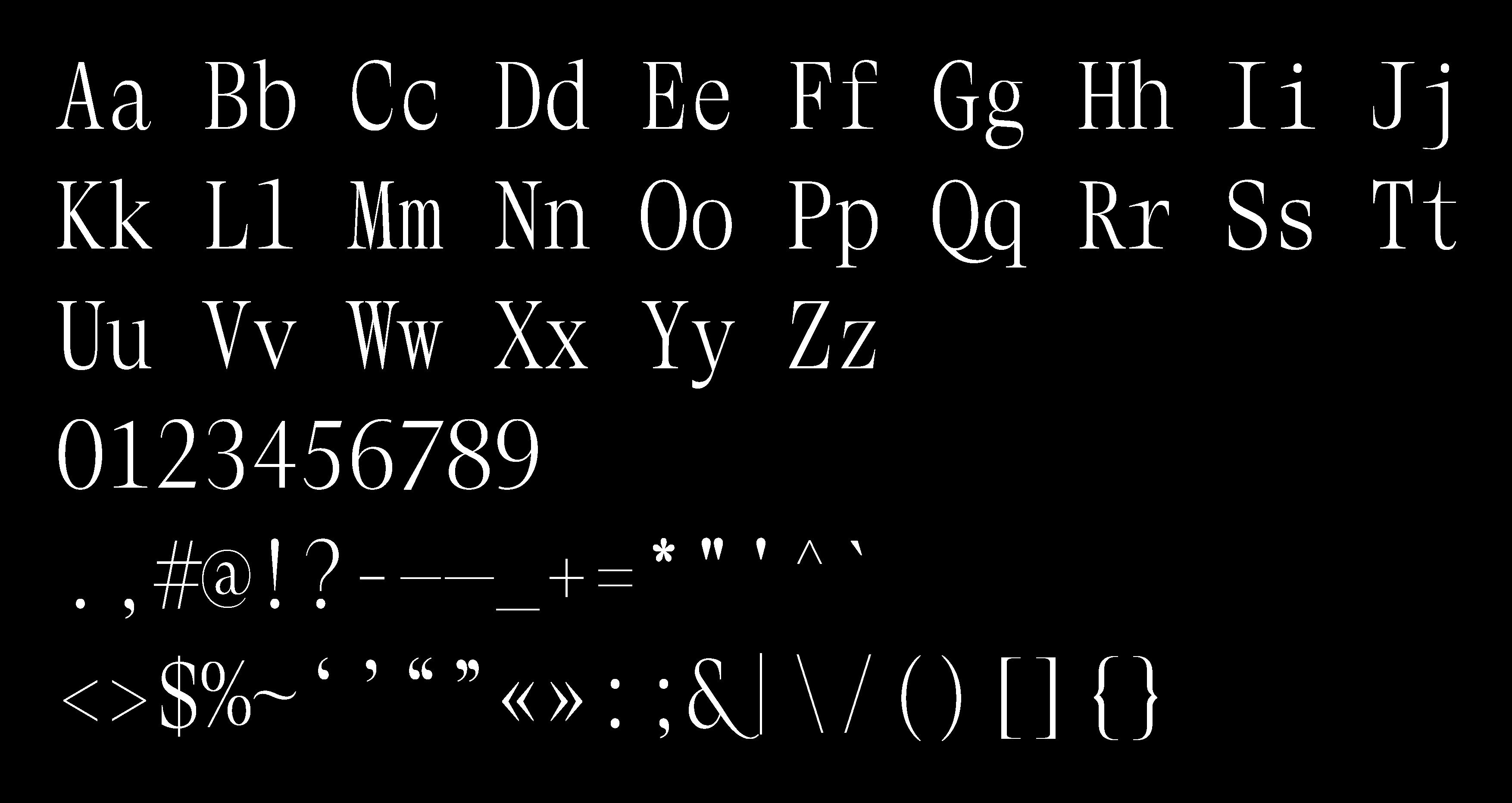 version of it (I worked with 'Display Light' weight) with lining figures, trying to keep the well-balanced lightness and overall impression of the original glyphs within the monospaced constraints.
A transcription
version of it (I worked with 'Display Light' weight) with lining figures, trying to keep the well-balanced lightness and overall impression of the original glyphs within the monospaced constraints.
A transcription 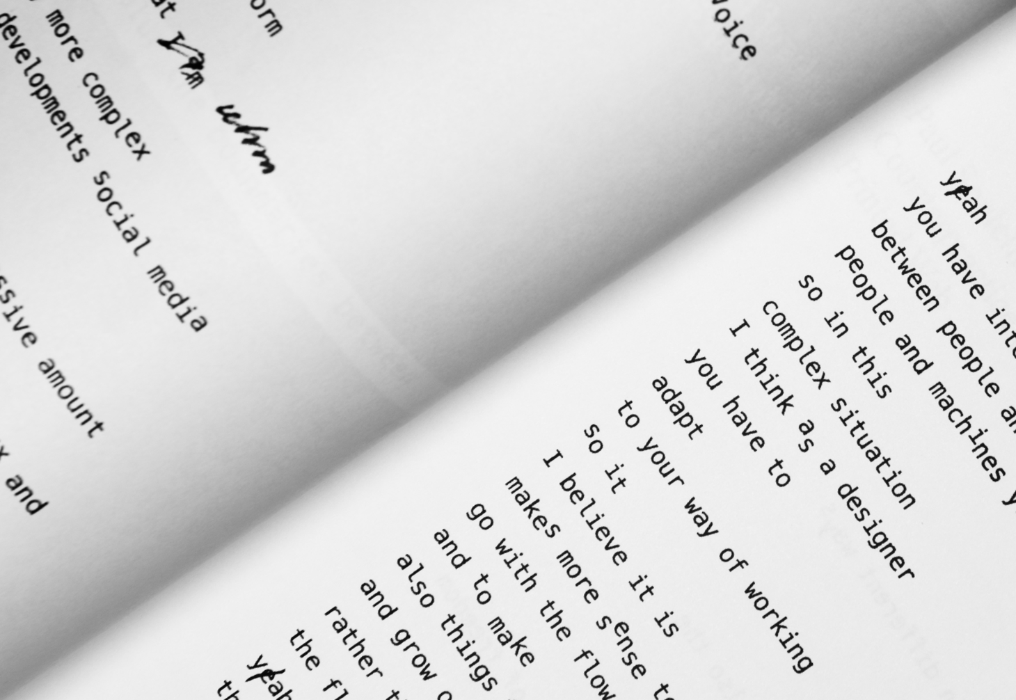 of the lecture excerpt by Luna Maurer from Moniker, designed in a way to reflect the content & the speech itself.
At Moniker they work with the influence of the media and technology on our everyday life and focus on processes rather than products. Using a similar ‘conditional’ approach, my typesetting became the process and the product, influenced by the recorded speech sound wave visual appearance. Sometimes some misunderstandings occurred (say, computer heard 'Monica' instead of ‘Moniker'), so it became a project about the interaction between human and a machine in general, between human speech and its computer recognition in particular.
The curatorial essay
of the lecture excerpt by Luna Maurer from Moniker, designed in a way to reflect the content & the speech itself.
At Moniker they work with the influence of the media and technology on our everyday life and focus on processes rather than products. Using a similar ‘conditional’ approach, my typesetting became the process and the product, influenced by the recorded speech sound wave visual appearance. Sometimes some misunderstandings occurred (say, computer heard 'Monica' instead of ‘Moniker'), so it became a project about the interaction between human and a machine in general, between human speech and its computer recognition in particular.
The curatorial essay 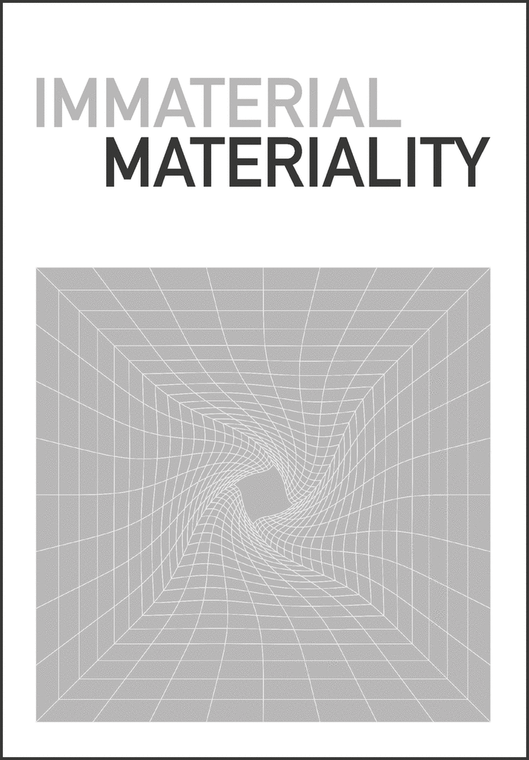 exploring the establishment of the Einstein's Spacetime concept in avant-garde art.
From the beginning of the 20th century, space became not an absolute anymore but generated by matter, without which it would not have existed. Similarly, art stopped being limited to the representation of concrete, observative phenomena; instead, it became a pure construction of the mind. Many avant-garde artists of that time tried to incorporate these concepts into their works, but I have selected those who let one physically experience the unity of time, movement and space, rather than being just a symbolic visualisation of scientific theories.
A small project
exploring the establishment of the Einstein's Spacetime concept in avant-garde art.
From the beginning of the 20th century, space became not an absolute anymore but generated by matter, without which it would not have existed. Similarly, art stopped being limited to the representation of concrete, observative phenomena; instead, it became a pure construction of the mind. Many avant-garde artists of that time tried to incorporate these concepts into their works, but I have selected those who let one physically experience the unity of time, movement and space, rather than being just a symbolic visualisation of scientific theories.
A small project 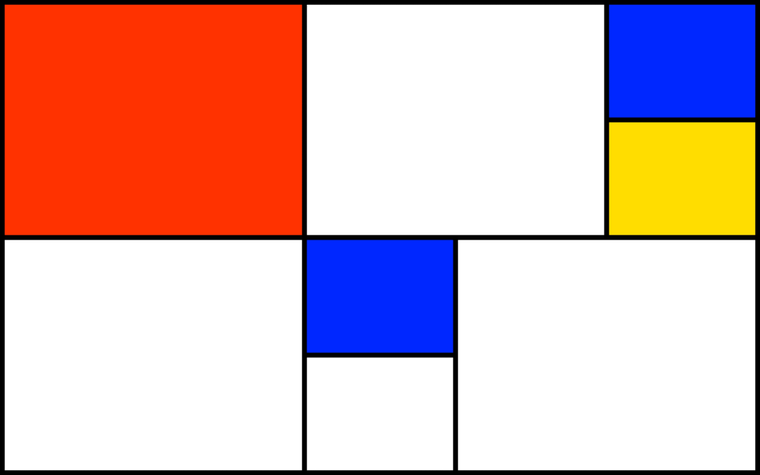 about choosing suitable content to work well with an already existing layout.
The whole idea of this brief seemed simple yet unusual as it required a different decision-making process: instead of gathering obligatory materials first and only after that focusing on the arrangement of all the elements, this project provided the freedom of selecting any kind of visual elements, however, together with particular moving layout with its own logic and rules (it was a ‘shifting tiles’ mode for Mac OS screen saver). Eventually, my outcome turned out to form a kind of Mondrian's imagery generator.
A book
about choosing suitable content to work well with an already existing layout.
The whole idea of this brief seemed simple yet unusual as it required a different decision-making process: instead of gathering obligatory materials first and only after that focusing on the arrangement of all the elements, this project provided the freedom of selecting any kind of visual elements, however, together with particular moving layout with its own logic and rules (it was a ‘shifting tiles’ mode for Mac OS screen saver). Eventually, my outcome turned out to form a kind of Mondrian's imagery generator.
A book 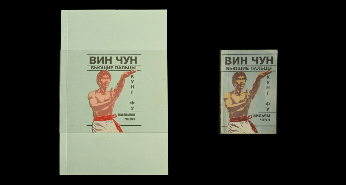 designed as a visual response to another book, found in the secondhand bookshop.
I have noticed a massive amount of printing problems with this found old book. Odd images, strange typographic decisions and mistakes, poor quality of paper through which you can see several overlapped pages. But then all these indignations turned out to become the inspiration for the ideas on how to interpret this book. As a result, each page in my book is constructed imitating that disturbing transparency of the original. To add more visual connection from the very beginning I also did an additional plastic cover. When it is on the book, it almost duplicates the cover of the original. And taking it off visualize what has been excluded from the original book.
An astrological bot
designed as a visual response to another book, found in the secondhand bookshop.
I have noticed a massive amount of printing problems with this found old book. Odd images, strange typographic decisions and mistakes, poor quality of paper through which you can see several overlapped pages. But then all these indignations turned out to become the inspiration for the ideas on how to interpret this book. As a result, each page in my book is constructed imitating that disturbing transparency of the original. To add more visual connection from the very beginning I also did an additional plastic cover. When it is on the book, it almost duplicates the cover of the original. And taking it off visualize what has been excluded from the original book.
An astrological bot  generating odd daily forecasts. So generalized, yet so personal.
Shortly, this bot sends you short predictions every day, one for each astrological sign. The algorithm and generative logic behind it is built the way, that sometimes these small messages deliver nonsense and confusion, sometimes they look quite neutral (or even seem very personalized, you know, stars know best). Anyway, everything is like in the real big world of true horoscopes. So, your Mercury's in retrograde, check it here.
A lyrics animation
generating odd daily forecasts. So generalized, yet so personal.
Shortly, this bot sends you short predictions every day, one for each astrological sign. The algorithm and generative logic behind it is built the way, that sometimes these small messages deliver nonsense and confusion, sometimes they look quite neutral (or even seem very personalized, you know, stars know best). Anyway, everything is like in the real big world of true horoscopes. So, your Mercury's in retrograde, check it here.
A lyrics animation 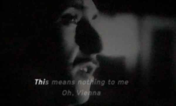 music video.
Not a whole video though, just a one-minute fragment of the chosen song. My decision was to work with ‘Vienna’ by Ultravox. I wanted to keep the original video layer as the main element, not as some kind of supporting background for the attention-seeking lyrics (like many videos of this genre look like). So, I used the slightly modified original video (by re-filming its projection on the wall, which was made to avoid applying some desired analogues effects digitally) and animated lyrics, typographically imitating some kind of old subtitles appearance. So, if you are interested in what ‘Oooooh, Vienna’ may look like, you are welcome to watch, listen and sing it here.
An essay
music video.
Not a whole video though, just a one-minute fragment of the chosen song. My decision was to work with ‘Vienna’ by Ultravox. I wanted to keep the original video layer as the main element, not as some kind of supporting background for the attention-seeking lyrics (like many videos of this genre look like). So, I used the slightly modified original video (by re-filming its projection on the wall, which was made to avoid applying some desired analogues effects digitally) and animated lyrics, typographically imitating some kind of old subtitles appearance. So, if you are interested in what ‘Oooooh, Vienna’ may look like, you are welcome to watch, listen and sing it here.
An essay 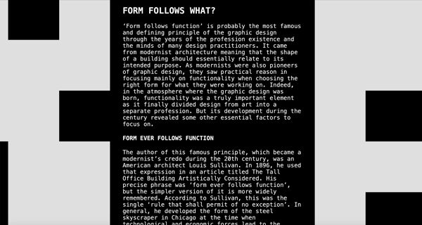 questioning one of the most famous 'rules' of many visual communication areas throughout the decades.
'Form follows function' is probably the main defining principle of the graphic and product design, inherited from the modernist architecture back at the beginning of the 20th century. But the notion of the 'form' was constantly developing during the century & finally revealed that in order to succeed various forms of various design fields have much more directions to follow. The full essay is available here.
A digital publication
questioning one of the most famous 'rules' of many visual communication areas throughout the decades.
'Form follows function' is probably the main defining principle of the graphic and product design, inherited from the modernist architecture back at the beginning of the 20th century. But the notion of the 'form' was constantly developing during the century & finally revealed that in order to succeed various forms of various design fields have much more directions to follow. The full essay is available here.
A digital publication  for the Fine Arts degree show at BHSAD, that was planned to take place this summer of 2020 but was indefinitely postponed due to the present situation with the coronavirus.
Initially, it had to be a printed catalogue describing each participating artist’s final work, but within the circumstances of sudden uncertainty its format changed from physical to digital and its content changed from the description of finished works to a collection of draft pieces of work in progress. Working in collaboration with another designer, we decided to reflect in our publication this vague mood, shifted and uncertain deadlines and other difficulties we face today.
Some information about who I am
for the Fine Arts degree show at BHSAD, that was planned to take place this summer of 2020 but was indefinitely postponed due to the present situation with the coronavirus.
Initially, it had to be a printed catalogue describing each participating artist’s final work, but within the circumstances of sudden uncertainty its format changed from physical to digital and its content changed from the description of finished works to a collection of draft pieces of work in progress. Working in collaboration with another designer, we decided to reflect in our publication this vague mood, shifted and uncertain deadlines and other difficulties we face today.
Some information about who I am  and how to contact me.
My name is Irina & I am a graphic designer. After (actually, during) getting a degree in International Relations and History I realized that I need to find a way to bring any kind of theoretical knowledge and other information to practice through the visual communications. As a result, I continued my education in Graphic Design at Central Saint Martins and British Higher School of Arts and Design. In my works I enjoy bringing together analogue and digital, real and imaginative, chaotic and organized, clear and ambiguous, abstract and concrete, personal and general. I’m open to new projects and collaborations, so you can reach me via e-mail or Instagram.
and how to contact me.
My name is Irina & I am a graphic designer. After (actually, during) getting a degree in International Relations and History I realized that I need to find a way to bring any kind of theoretical knowledge and other information to practice through the visual communications. As a result, I continued my education in Graphic Design at Central Saint Martins and British Higher School of Arts and Design. In my works I enjoy bringing together analogue and digital, real and imaginative, chaotic and organized, clear and ambiguous, abstract and concrete, personal and general. I’m open to new projects and collaborations, so you can reach me via e-mail or Instagram.